Publication
A Project for Serious Players: How We Built a Corporate Website and a Unified Digital Ecosystem


First Impressions Start on the Homepage
What is TNF? It’s Russia’s premier event in the oil and gas industry — a key platform that brings together equipment manufacturers, service providers, resource developers, and policy-makers defining the country’s industrial and tech strategy. Each year, the forum hosts large-scale events with participation from top government officials and executives of major corporations. In other words — it’s a big deal.
Naturally, the website had to reflect that seriousness — and, more importantly, be clear and intuitive. That’s exactly what the client asked us to deliver.
We began by analyzing the target audience. Most users turned out to be older professionals accustomed to the structure of the previous site. A significant portion also access it from mobile devices — so the mobile version needed to perform just as well (if not better) than the desktop.
We also discovered that users rarely engaged with the homepage itself, instead heading straight to internal pages for specific information. So, our homepage strategy became clear: make it visually compelling, communicate the event’s essence, and keep it focused on only the most essential content.
Everything Starts with a Dot
The goal was to give the forum’s digital presence a sleek, modern, high-end feel — something that spoke to both innovation and precision. For inspiration, we looked to one of our previous projects, the Dvizhenie site, which paired rich visuals with a minimalist use of text.
The key objectives:
- Streamline structure and navigation
- Simplify access to essential information
- Align the visual identity with the forum’s branding
- Boost awareness of TNF as an annual flagship event
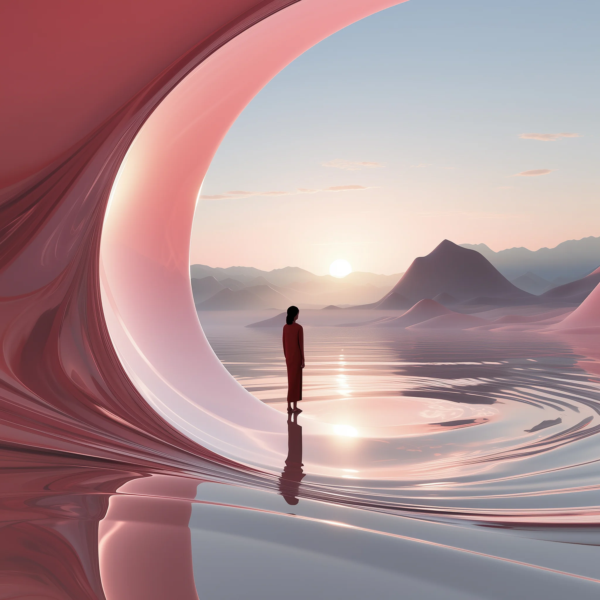
The new concept revolved around a core theme: energy, motion, and constant exchange. This reflected the forum’s dynamic nature, where ideas and expertise are continuously shared. To bring this to life, we used animated gradients and smooth color transitions between sections — a visual metaphor for perpetual motion.
We also reinterpreted TNF’s existing logo, which features a single dot. We saw it as a symbol of energy — the initial spark. That dot became a recurring motif throughout the interface: embedded in buttons, navigation elements, and links.
One Cohesive Ecosystem
Much of the project revolved around restructuring. The previous site was overloaded and difficult to navigate, so we focused on decluttering and introducing consistency in layout and visual language.
Our solution was both elegant and efficient: we split the content into two distinct pillars. The first — the forum itself, the centerpiece of the brand. The second — the broader TNF ecosystem, which includes various other events held throughout the year. Separating these saved both development and maintenance costs moving forward.
The new structure clearly distinguishes between pages dedicated to the forum and those related to the parent organization — including news, events, contacts, and user accounts.
This also meant rebuilding the admin panel from scratch. We unified content blocks across the main forum and other event sites, enabling seamless updates from a single backend. Everything is now editable — right down to the button labels.
A “Simple” Solution That Was Anything But
One major visual challenge was implementing a full-screen animated gradient with smooth blending and movement. Our usual go-to is HTML5 Canvas — it runs in the browser and works well on most devices.
We started with colorful moving circles, each with gradient overlays and blur effects to blend them into one another. It looked great in Chrome — but Safari? Not so much. Instead of smooth blends, Safari rendered raw circles with no blur.
Turns out, Safari handles canvas filters differently. So we pivoted to WebGL — a more powerful browser-based technology that leverages the GPU to render 3D graphics.
Using Three.js, we created an animated gradient on a flat plane with a fragment shader — allowing for time-based color transitions. This produced the smooth, organic motion we wanted. To make the effect feel more alive, we added subtle distortions and variations.
In the end, switching to WebGL was the right call. The result was a visually stunning animation that worked reliably across browsers and was even less resource-intensive than the original canvas solution.
Interactive 3D Booth Builder
We also developed a browser-based interactive 3D booth constructor for forum participants. It lets users customize layouts, add booth elements, rotate the model in real time, and instantly visualize how their brand will appear in the exhibition space.
Built with Three.js and WebGL, the tool strikes a balance between high visual fidelity, customization flexibility, and a gamified user experience. It’s now a cornerstone feature of the forum’s digital toolkit.
Final Results
The final visual identity is minimal yet impactful — combining vibrant colors and tech-driven design with a clean, professional tone. This was crucial, given the core audience: high-level officials and executives who typically spend only a few moments on the site. We had to convey premium quality, seriousness, and innovation — immediately, and convincingly.
Overall, building this corporate site was a rewarding challenge. Given the scale and tight deadlines, we split the work between two dedicated teams. Once the design was finalized and core sections built, we brought in additional developers to accelerate delivery. Weekly sprints and merge requests kept things on track, but what really made it work was a unified team committed to getting it right.