


Publication
Aesthetic Design: Why Companies Choose Pastel Colors and Calm Over Visual Noise

A website that sells flower pots wholesale for the European market. It’s one of our clearest examples of how pastel shades can be used in design. All the following references were sourced online.
What makes aesthetic design feel soft and human?
Pastel colors evoke trust and calm. They don’t shout — they gently draw the eye and create a sense of lightness. Color psychology explains this easily: soft tones are associated with safety, care, and harmony. That’s why brands striving for humanity and visual empathy often choose pastel palettes as part of their identity. In modern web design, these palettes have become a visual language of trust — a signal that a brand isn’t afraid to be quiet.
“Soft color is a form of respect for the viewer. It doesn’t shout — it listens.”
— Leatrice Eiseman, Pantone Color Institute
The identity for the waterproof technology exhibition is built around the metaphor of a water strider. Its silhouette, refracted through light on the water’s surface, creates soft ellipsoidal shadows on the bottom of the reservoir.
Why color in design is a form of empathy
Color has the power to guide attention and shape emotion. Pastel palettes don’t overwhelm — they direct the eye gently, creating a sense of comfort and order.
As the Nielsen Norman Group notes:
“Color is one of the most important and influential tools a designer has.”
For a brand, this is more than a matter of taste. A calm color palette conveys maturity and trust — qualities that increasingly influence user decisions as much as price or product features.
When the visual environment is quiet, it becomes easier for the user to focus on meaning. This is the real aesthetics of interfaces: when a person’s attention is not seized, but respected.
A website designed to showcase the advantages of the Atmos lamp — its efficiency, aesthetics, and seamless integration into interior spaces. The visual concept is built around imagery of forests and natural light, creating a feeling of warmth, well-being, and harmony.
Aesthetic web design is getting quieter
In an era of constant information pressure, users are seeking visual relief. Pastel colors offer a resting point for the eyes and allow content to be perceived without fatigue. While every banner competes for attention, soft palettes create a visual pause and a sense of harmony. They make interfaces feel light and structured while taking care of the viewer’s perception. Desaturated colors are becoming the new standard — not a passing trend, but a reflection of a growing visual ethic.
Design for a banking application featuring a clean, minimalistic visual style.
How aesthetic design has changed: from Rococo to Instagram
Pastel colors have historically resurfaced during periods of cultural reinvention. In the 18th century, Rococo artists such as Watteau and Fragonard explored the power of light, airy shades. In the 1950s, pastels became symbols of post-war optimism: mint refrigerators, pink cars, sky-blue kitchens — all markers of a brighter, easier life.
TIME wrote about Pantone’s 2016 selection of Rose Quartz and Serenity:
“Serenity is weightless and ethereal… it brings a sense of respite and calm even in troubling times.”
In the 2010s, pastel colors took over Instagram, becoming the visual language of restraint and curated calm. Soft lighting, neutral backgrounds, and powdery accents shaped a new aesthetic vocabulary. This is how pastels moved from art to digital branding — as a universal code of visual trust.
Crises make design aggressive — and why this is changing
In times of uncertainty, brands often lose their sensitivity. The struggle for customers turns into a battle for attention: pop-ups, neon colors, intrusive discounts. This kind of visual shouting may grab attention for a moment, but it rarely builds trust. What works in the long run is not loudness, but respect for attention.
Against a backdrop of anxiety and overload, people intuitively seek places where they feel calm — where they are treated with respect, where design doesn’t demand but invites. This is why more companies are shifting from pressure-based marketing to aesthetic trust: muted tones, honest visual communication, clean interfaces.
This contrast is especially visible in premium segments. These brands understood long ago that people with money are not naive. They don’t need to be “pushed” with discounts or flashing banners. An audience accustomed to being respected expects that same respect in a brand’s visual language. For them, tact is not a weakness — it is a mark of status and maturity. That’s why, in luxury and premium niches, aesthetic design has long become the norm: clean forms, calm colors, and the absence of intrusiveness.
Over time, this approach will spread more widely. People grow tired of being overwhelmed and shouted at — and they begin to seek out brands that speak to them respectfully, even without the premium price tag. This will be the true victory of aesthetics: when calm ceases to be a luxury.
We genuinely believe this path is inevitable. Because the purpose of design is not to sell louder, but to make the visual world more humane. Aesthetics, in its true sense, is not about “beauty” — it is about care, clarity, and respect. And if we can communicate that through color, form, and space, then design is doing its job. The role of aesthetics is not to decorate, but to change our relationship with attention, with people, with perception itself.
Polymorphic Capital is a dynamic, technology-driven fund focused on practical and innovative Web3 solutions — from payments and social applications to confidential computing and AI tools.
What are “soft visuals,” and why are they trending?
Soft visuals are the visual language of a new sensitivity. They rely on gentle forms, natural light, and a sense of balance. People today seek not stimulation, but equilibrium. Pastels are part of this movement, along with neutral typefaces, fluid animations, and natural textures.
Modern aesthetic design isn’t about impact for its own sake — it’s about creating a feeling of presence. It communicates: “I’m here, but I don’t get in the way of who you are.”
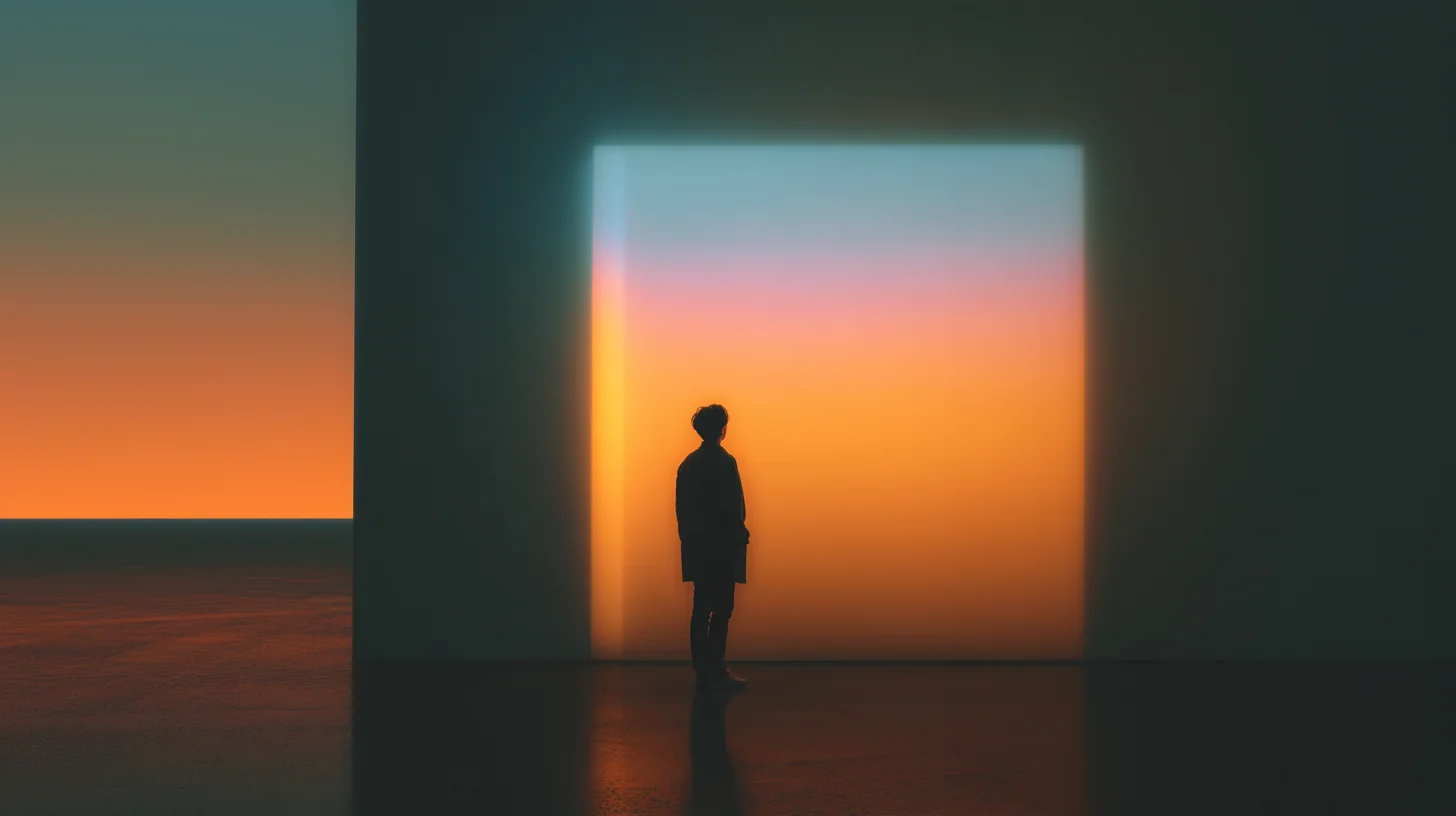
Familiar scenes become slightly distorted, creating a calm kind of dissonance. Objects appear out of place, spaces suddenly feel either empty or overcrowded, and everything around takes on the quality of a pink dream — subtle, yet quietly surreal.
Where design aesthetics is heading — toward a new era of respect
Today, more and more signs suggest that the age of engagement is giving way to the age of mindfulness. People are seeking brands that don’t fight for attention, but create a sense of calm. Companies that intentionally adopt an aesthetic of respect tend to see not only stronger loyalty, but also a shift in how their brand is perceived on the level of emotional UX. Visual calm becomes part of their reputation.
Historically, pastels have reemerged whenever society feels the need to restore balance. And now they are not just a trend, but a response to fatigue from constant overload. Pastels symbolize this shift: gentleness instead of aggression, clarity instead of noise, humanity instead of manipulation.
Summary
How does aesthetic design influence brand perception?
It fosters a sense of trust and respect, helping reduce user anxiety.
Why have pastel colors become a trend?
They are a response to visual overload: soft tones create a feeling of calm and clarity.
How does a crisis affect the visual style of brands?
Companies shift from marketing pressure to aesthetic trust, choosing restraint over noise.
What is visual empathy?
It’s the ability of design not only to draw attention, but to care for human perception and cognitive comfort.
Contemporary aesthetic design reflects a shift from competing for attention to respecting it.
In a world defined by crisis and overload, people gravitate toward visual honesty and calm.
Pastel colors have become a symbol of this emerging visual ethic — soft, intentional, and deeply humane.
.png&w=3850&q=85)
.jpg&w=3850&q=85)
