

Publication
Energoline: The Cleanest Project We Shipped All Year — and Why the Client Deserves Half the Credit
We have a ritual: once a week the team gets together and pulls a recent project apart — we call it “Smotriny” (the viewing). Usually it’s an even split between praise and complaints. But the Energoline review went strangely: there was almost nothing to pick at.
“Of our recent projects, this is honestly the cleanest and the most thoroughly considered one,” our art director said at the meeting. Then he added the detail that makes this story worth telling: it came together faster than other projects of a similar scope.
Let’s unpack how that happened.
Who Energoline Is
Energoline supplies equipment for the power industry. Their core specialty is gas turbine cooling.
To give you a sense of scale: one of these cooling systems is essentially an air conditioner the size of a two- or three-story house. It pulls in outside air, runs it through radiators, and cools the turbine. Energoline supplies these systems, modernizes them, and services them.
There’s a wrinkle that explains a lot about their business. Power equipment in Russia has historically been mostly European and American — Germany, the US. In recent years, importing it has become considerably harder, and the company runs a network of legal entities worldwide through which supply still moves. But you can’t lean on that forever, so the focus is deliberately shifting: less “buy it and ship it,” more engineering, service, and in-house expertise. The site had to reflect exactly that pivot.
They Had No Website at All
A company with serious expertise, an international network, and its own manufacturing — and no website. We split the work into two iterations: first a landing page, so they’d have a presence quickly, then a full site with an admin panel, interior pages, service directions, projects, and news.
A Client Who Showed Up With a Brand Book
This is where the answer to “why so fast, why so good” begins. Energoline didn’t arrive empty-handed — they came with a finished visual identity: a solid brand guide, a considered logo (the letter “Э” hides part of a graph from an energy law — a detail you don’t catch right away), and a pile of genuinely useful material. The orange that carries the whole site is their brand book, not our call.
But assets are only half of it. The bigger thing: the client listened and trusted us. Deadlines were discussed calmly, nothing was on fire. The client assembled the content for each direction themselves — which mattered enormously, because the domain is genuinely complex: what equipment, for whom, why, how it all connects. Without them we’d have been guessing.
What We Did With Their 3D
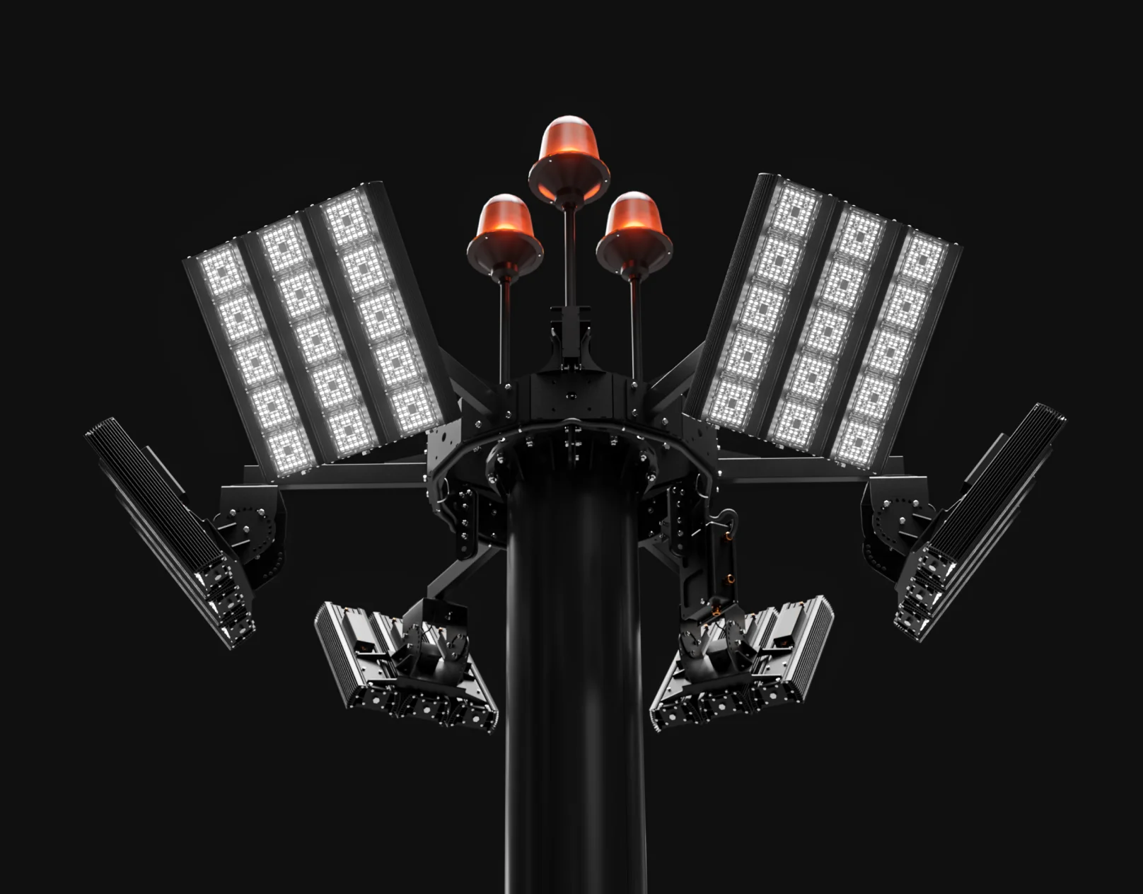
The client sent us equipment models. Our designers turned them into renders — and this is a case where the source and the result look nothing alike. Turbines, cooling systems, custom-machined parts read like product photography rather than technical documentation.
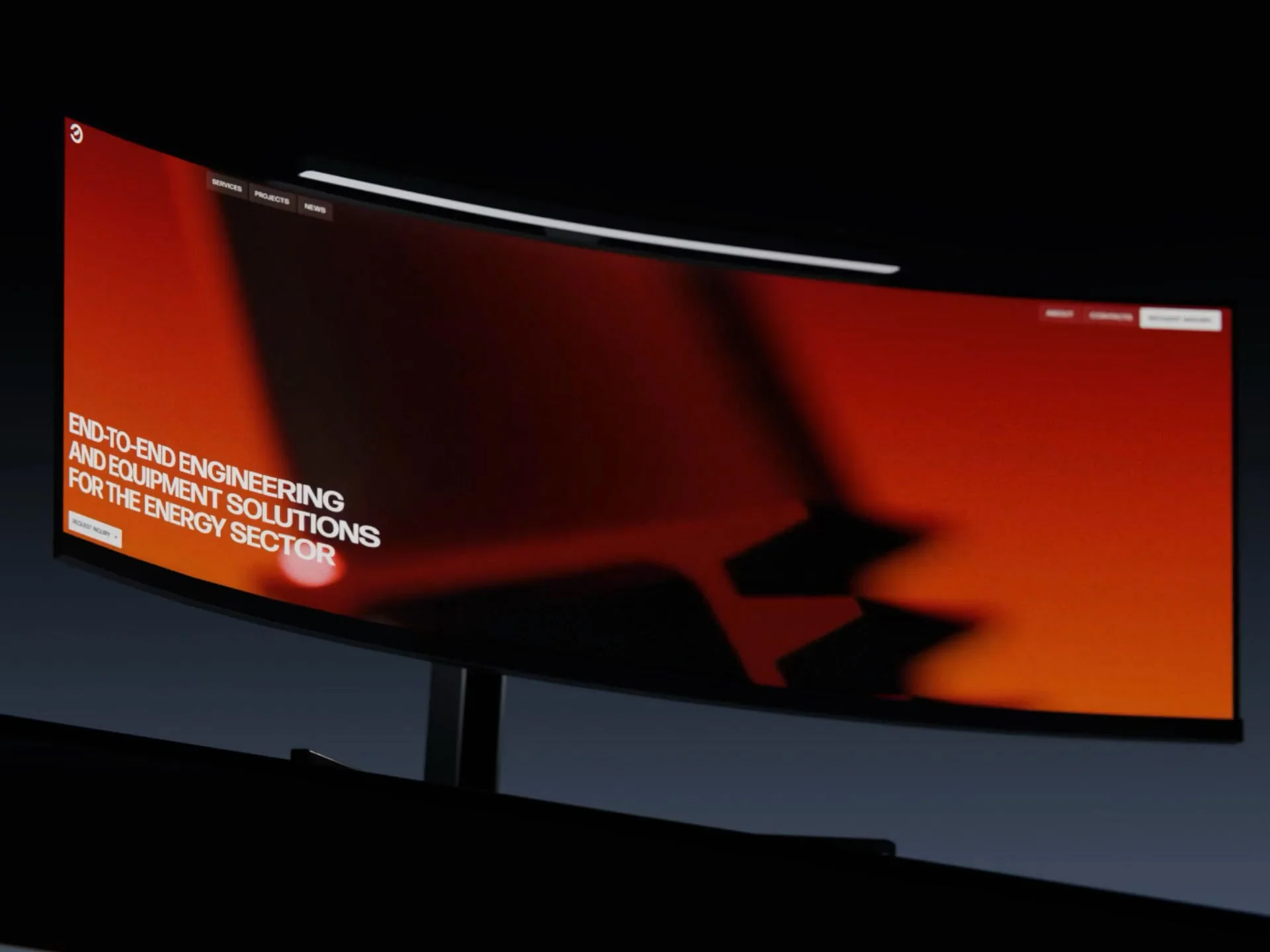
The hero opens with a looping video: a turbine blade rotates, blades assemble into a ring, the ring begins to spin and cool. It’s beautiful, and it literally explains what the company does. The header is its own story — a semi-transparent blur that, on scroll, looks like the interface is interpreting the content beneath it. That effect drew the loudest reaction at the review.
AI Speeds Things Up. But It Doesn’t Decide
Without AI this project wouldn’t have moved so fast. We used it at every stage — from preparing renders and exploring visual ideas to generating code and routine markup. It genuinely saves days. But it’s important not to lie to ourselves here: AI speeds the work up, it doesn’t replace it. It’s only as good as the material it’s given and the person making the decisions.
First — a quality design file. Not just a “pretty picture in Figma,” but a file broken down into tokens, styles, and components. When design is handed off with that structure, both a human and an AI read it the same way: colors come from tokens, spacing from the system, blocks from ready components. That turns code generation from a lottery into a predictable process. AI won’t save a bad file — it’ll just multiply the mess faster.
Second — finishing by hand. AI never hands you a finished result — it always needs finishing “by hand” until the picture feels pleasant, individual and evokes the right emotion. That’s exactly what a studio is hired for. Precise spacing, scroll behavior, micro-interactions, that glass-header effect — all of it was finished by hand. Those details are what separate “generated” from “made.”
Why, in the Age of AI, the Team’s Eye Decides
Here’s an uncomfortable truth: AI today is equally available to everyone. The same tool sits in our hands, in the hands of a studio assembled yesterday, and even in the client’s own team. The difference isn’t the tool — it’s who’s driving it.
AI produces dozens of options. But choosing the one that actually works takes a trained eye. You have to feel where a composition falls apart, where the lighting in a render looks cheap, where the typography drifts, and where a solution looks expensive and right. You can’t google that or generate it. It’s earned over years.
У нас 16 years of experience and a trained eye specifically in image-driven solutions and visualizations. That’s what turns “AI + a structured file + finishing by hand” into a result that doesn’t look like a generative template. Here AI is the accelerator. The team sets the direction.
A Page Builder Instead of Rigid Templates
Three directions, each with its own detail page. But we didn’t build three separate templates. Instead we built a block system: a page assembles from components — with an image, without, with a list, with an extended description. The client can rebuild a page however they like without coming back to us. Pages built from identical blocks don’t look alike.
Why It Came Together Fast
The design file. “Zhenya (our designer) — a beautiful file, Figma, all structured, a masterpiece,” said our frontend team lead. When a design is broken into components, you save days, not hours — for both a human and an AI.
The architecture. Astro on the frontend, separated front and back, connected over a REST API. Frontend and backend worked in parallel and converged at the end. Follow the structure and it assembles like a kit.
Performance out of the box. PageSpeed hit 100 on desktop and 96–98 on mobile before analytics went in. With metrics attached, mobile dropped into the eighties — but desktop still holds at 100.
What Didn’t Make It
In fairness, not everything landed as planned. The “About” block was meant to carry infographics — company figures, headcount, project count. The client couldn’t settle on which numbers belonged there. We pulled the infographics, and the block now looks a little bare. There was also an idea for a company page with the human stories — they have their own hockey team. parked for now.
What We Took Away From It
The project proved that “fast,” “on budget,” and “beautiful” aren’t mutually exclusive. The constraints were real — both money and time. But the combination worked: a structured file, AI on the routine, finishing by hand, and the eye that steered all of it. The result doesn’t read as a compromise and doesn’t look generative.
The real lesson is about the client. If Energoline had pushed on deadlines, changed requirements mid-flight, and second-guessed our decisions, the project would have been longer, more expensive, and worse. It would have been ordinary.
So if you’re a client reading this: bring your materials, trust the team, and don’t start a fire where there isn’t one. You’ll get a beautiful project and near-perfect PageSpeed.
Tested on Energoline.
Want the same?
We build sites that load fast and look like someone thought about them. Because someone did — for 16 years running.
Get in touch: https://t.me/chipsadesign